Wednesday, April 27, 2011

SUPER DINOSAUR.


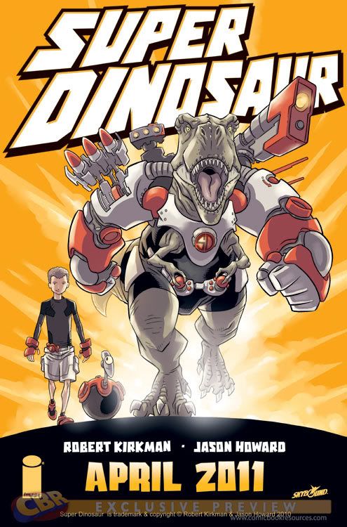
Hello, I just read an awesome new comic by Robert Kirkman and Jason Howard. And although there is only one issue so far it's already awesome, because it is about a boy genius and his freindly super intelligent Tyranosaurus Rex... with mech armour. Do I need to say any more?

Art by Jason Howard Super Dinosaur (C) Robert Kirkman and Jason Howard

Thursday, April 21, 2011

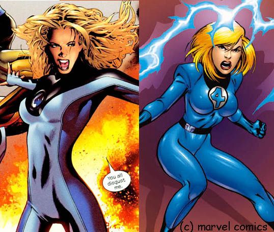
I Can't Stand Greg Land.


Well that's not completely true but it got your attention. What I can't stand is the type of comic art that he represents. Mr. Land is a photo realist, and I don't think photo realism works well, or at all, for storytelling with sequential art. Photo realism in art terms is a school of art where the idea of the art is to make the image look like a photo. Not like real life, like a photo, including all lens distortions and all other visual quirks of the photo. The idea is that the act of making the image not what the image is of is the art. This style of art is usually done by taking a picture tracing it onto a surface and then rendering the image using the photo as reference. Now many of Mr. Land's detractors dismiss what he does as "just tracing". And while it's true that there is tracing involved in photo realism more often than not there's a bit more to it. You have to know how to draw to make this technique work, anybody can light box a picture onto a bristol board, but trust me if you don't know how to draw it will look like a kindergartner did it. There is also composition and "costuming" so I will not accept the "just a tracer" slight. I won't however defend him on his dubious choices of reference material. Just Google Greg Land and you'll know what I'm talking about. No the reason I don't care for Mr Land is not because I dislike his skills or choices but because, I think Photo realism makes for poor reading comics.

Although there is a great history of photo realistic or classically realistic art in the history of comics, most notably in the old newspaper adventure strips by the likes of Foster and Raymond. For the most part comics in my opinion have worked best with cartooning as their art. Now I don't mean strictly simple cartooning like the daily comics, Neal Adams, for example, is fairly realistic but his work is still technically cartooning. My favorite type of comic is one in which your neither looking at the pictures or reading the words, but sort of experiencing them both at the same time. If you've ever been totally immersed in a comic, especially a manga, you know what I'm talking about. But photo realism, I've found does the opposite. If anything it distances the text from the art, and you end up in a pattern of read the text look at the picture.

Also, photo realistic art has a trouble expressing character emotion. I have found, as a reader and as an artist, that to express things visually in a comic you have to "push" things a little farther. In other words if a good expressive comic where to magically become a film we would be cringing at the melodramatic acting. Cartooning does this well you can push things from a huge expression up to a wild take and still read as real. But if you do this with Photo realism, Or even painterly realism you go outside of what looks right. Realism has to work in subtle shades that make expression difficult to non existent. Unless you are an extremely exceptional artist most of the time it's just flat, after all that was the intent of the photo realism movement . In all fairness, expressiveness is not "required" in fact many artists such as Chris Ware actually choose to make their comics anywhere from less expressive to outright flat, though these artists are usually cartoonists, and they usually have some sort of alternative agenda. But in "mainstream" comics, where the practice of photo realism is more common, they tell standard narratives where expression and emotion are not only a good thing but a required thing for readers to engage.

And finally, and this is really only for "genre" comics, it interferes with the suspension of disbelief. We buy into a lot of weird shit in a super-hero comic book. And I have found I at least tend to ask less questions of it when it is good old fashion cartoon artwork. When a work is realistic, one starts to notice just how silly guys in tights fighting giant robots and gorilla's look. A good example for me is Kingdom Come. Now Kingdom Come is a great comic but Alex Ross' stunning realism does not help it a bit, in my opinion. Because as awesome as the events in the story where, you saw a guy in tights smacking stuff, and a lot of it just looks silly. I think if it where handled by an artist like George Perez, it would have been more effective, but maybe I don't know anything, it won a hell of a lot of awards.

Now to be fair since I've been slagging on High Realism especially Photo Realism in comics. There are times when it does work. A great example is "MARVELS" also Illustrated by Alex Ross. For those of you who have never read "MARVELS" it can be best summed up as the history of marvel comics as seen by a Daily Bugle photographer. Due to the concept of a ground eye view, extreme realism is a good way to go. It grounds the story in our dreary real world and makes the colorful super hero world seem great and foreign. True, some things still look cheesy, Spider-man's socks for example, but since it, operates on a "what if they where real" premise and actually, in a rare case, never tries to get you to suspend your disbelief.

So, there you go a very long answer as to why I don't like Greg Land, it's got nothing to do with "tracing", or with plagiarism accusations from fan-boys, or even the fact that he outright admits to sourcing his images from porn (which I think is pretty awesome not the using porn part but that he responds with a mas chingon "yeah I do... do something"). It's a much simpler thing, I don't think his art style works for good comic book storytelling.

Art by Greg Land and Mike Weringo Invisible Woman (C) & TM Marvel Comics

Tuesday, April 19, 2011

A Moment.

With the shuttle program winding down, I think we need to set aside all cynicism and just look at this picture for a second and think. We, Human Beings built this... in space. Just take that in for a second. Pretty awesome huh.

Thursday, April 14, 2011

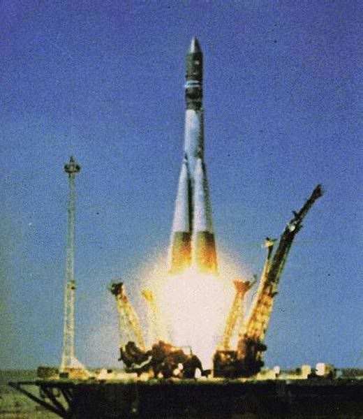
50 years.


I would have written this in a more timely matter, but, I was AFK for a week. So Pretend it's Tuesday okay....
The human race has been in space for a half century. Last Tuesday, April twelve, fifty years had passed since Yuri Gagarin was launched atop Vostok 1 where no man had gone before (couldn't resist:). It always amazes me how much chutzpa the space pioneers had. But no more so than the Soviets, you see we in the USA after 1958 had a centralized space effort but there was no such thing in the Soviet Union, what they had instead was a bunch of military weapons designers with big dreams. Their bosses weren't interested in manned spaceflight, but big rockets that could destroy all who opposed them. There was a great rivalry amongst the rocket designers and a government that was fond of funding and canceling, and reassigning projects on the smallest of whims. But it was in this environment that Sergei Korolev and his people made Vostok happen. By the early sixties Korolev and his people had already made the R-7 rocket, a craft that still is the back bone of the entire Russian manned space program to this day, as well as launched Sputnik 1 the worlds first artificial satellite. But Korolev was after sending a man up into space, so his team set about making the craft to do so, Object K what would come to be known as Vostok. however this was not the plans of the higher uppers. They wanted a spy satellite. So Korolev a master at working the system made a spy satellite out of Object K, so work could continue on the manned mission. As time went on however, Primier Nikita Kruschev, learned that space flights had great propaganda value, and a manned flight was put into works. The Vostok craft was far from an ideal spacecraft, essentially an artificial satellite with cargo space for a human payload. It had some basic controls and on re entry due to uncertainty of the shock of landing the Cosmonaut had to eject and parachute, at 7 km. But the mission was a success, the Soviet Union placed a manned space craft in orbit and the space age was truly born, sadly it would be many years until the anyone in the Soviet government saw space as anything more than propaganda currency, but more importantly it spurred on the Americans leading to that amazing period of technological growth that we call "the space race" eventually NASA would flounder and the Russians would become the leaders of space station technology. Eventually both programs joined forces to make the ISS. So that's 50 years down, lets hope for 50 wonderful more.

for many years the Soviet/ Russian space program was a great mystery to Americans. But these days we in the states have a great deal more available. If you want to learn more about this very interesting space program, a good essay, is the pamphlet "Russian Space Craft" by Robert Goodwin. and a good book is "Challenging Apollo" by Asif Siddiqi.

Also worth noting, April 12 was also the day of the launch of STS-1. the first of NASA's space shuttle flights, launched very purpously on the 20th anniversary of Vostok 1. I would opine about my thoughts on the Space Shuttle's demise later this year, but this is Yuri's day so I'll save it for later.

I hoped you enjoyed this quickie, I'll be back to my normal comics reviews next week. Cheers.

Tuesday, April 5, 2011

The Antelope Valley of Neuropsychosis


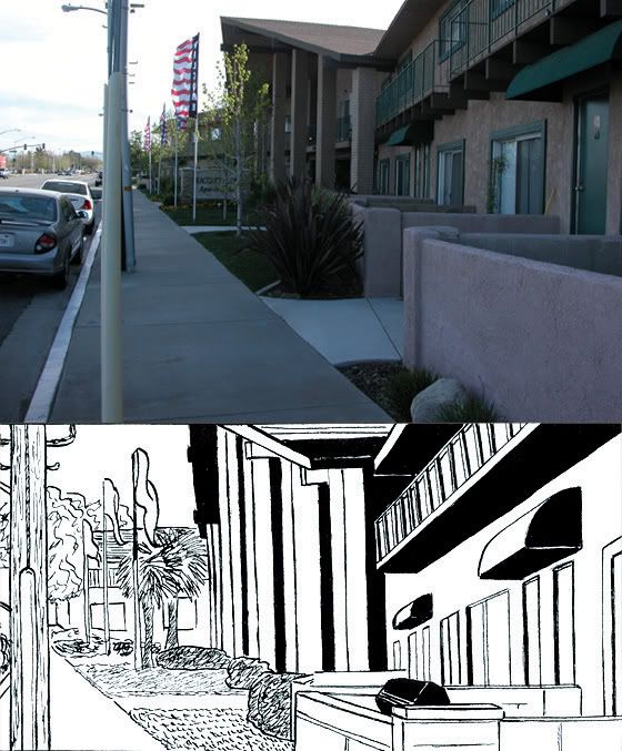
Hello Today begins a new series on this blog, where I talk about the locations of Neuropsychosis. Neuropsychosis takes place in my home town of Lancaster California, and the adjoining town of Palmdale and the non incorporated community of Quartz Hill, an area known as the Antelope Valley (A.V.). It's a group of aerospace towns about 60 miles north of Los Angeles to which it also serves as a bedroom community. Many of the places in my comic actually exist or have existed in the past, some have pseudonyms others are portrayed in their accurate glory. But to keep things interesting, I've made the A.V. of Neuropsychosis a hybrid of the A.V. Now and of the past. Kind of a greatest hits version in order to make a more interesting town for the setting of my comic.

The first location is the Racquet Club Apartments in Lancaster. This Apartment complex serves as the home of Toshi and Phil, as well as Melissa, Stef, and Jammy (they're neighbors if it hasn't been clear). It is located on 15th Street West and Ave. J-8. This apartment complex is where my best friend lived for a half a year after high school. As it was where I spent man days of my early adulthood, I have many fond memories of the times I spent there, thus I chose to use it as the home of my characters having the same experience. I haven't been in the complex since 1999, so other than the exterior, it is based on my memories of the place, which was a bit dingy but not quite low rent. The place looks a bit nicer now but I've maintained it's less than pretty quality from ten years ago. The rooms are base on my memories of my friends apartment, so it's more of a set than a location. And judging by the fact that the doors are right next to each other as opposed to spaced the width of an apartment, I've assumed that neighboring apartments are mirror images of each other. Thus the relative layouts of Toshi and Melissa's apartments.

I hope you have enjoyed this location in my Neuropsychosis tour of Lancaster. I've many more to come. Next will be the main location of “The Attack of the Killer Cheeps” the Antelope Valley Mall.

Sunday, April 3, 2011

Influence Map.

Over on DeviantArt there's been a meme going on of these influence maps and I fanally decided to do one, and then I decided my map would make a good entry over here at the wonder blog. Boy this was tough, I wanted to make it in a "how influential they where sort of order, but it kinda devolved into a "no particular order" to keep the design nice. So in no particular order
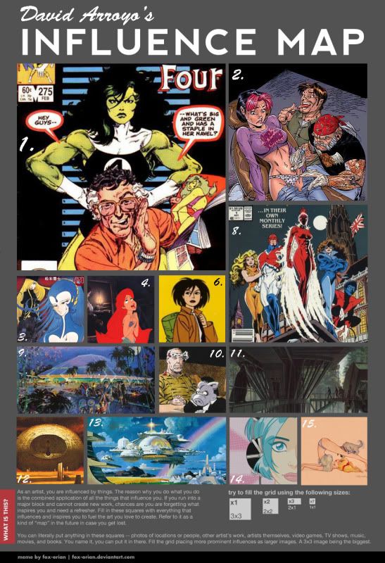
1. John Byrne.
John Byrne was my favourite comic artist when I first really got into comics. I especially liked his work on Sensational She-Hulk, Fantastic Four, and X-Men, his was also the first art I copied leading to my entire carrer in art. I still love many of his comics today.
2. J. Scott Campbell.
I had gotten out of comics for a while, and what got me back in was Gen 13 drawn by J. Scott Campbell. I loved (and Love) not just his toothsome women but also his fun designs and his visual sense of humour. It was his style i was trying to cop when I was 14 and first trying my hand at drawing without copying.
3. Leiji Matsumoto.
My Favourite Manga Ka. I love his layouts and timing, and it was through him that I started exploring manga in ernest.
4. Disney.
I love Disney animation, even when the movies suck they are made with a craft unequalled. I'm reluctant to name specific artists as thousands have drawn for these movies. but some favourites, whose art I've seen in isolation are. Frank Thomas, Ollie Johnson, Marc Davis, Andreas Deja, and Glen Keane, who's design for Ariel had quite an effect on my style (that's why the picture's her.
6. Jaime Hernandez.
Love and Rockets is one of the biggest things that's happened to me in comics in my recent life. From the moment I first read the new series (I went back to the old stuff soon after) I loved the art of Jaime Hernandez. Gilbert's great too, but dosen't hit me the same way. He does with simple cartooning what some guys can't convey in a million lines. His comics are alive. I also like his boldness with line and blacks. It was his influence that got me to go bolder with my ink work.
8. Alan Davis.
I've always liked his work, especially in the original Excalibur. In fact he was my second favourite artist after Byrne. I can't put my finger on why, but I like it. He's got that realistic yet still a cartoon style that I think works best for super heroes. I always think of his expressions while drawing (especially his big smiles). so he's on here.
9. Herb Ryman,
I love concept art, something about making and evoking a whole world with just a few brushstrokes. And Herb Ryman and the other early W.E.D. artists where the best. I love his use of colour, to evoke an emotion more so than convey "reality" a definate inflence on my Illustration and concept work.
10. Dave Sim & Gerhard
Cerebus is another of the biggest things to happen to me in recent years. Dave Sim Self Published this series between 1977 and 2003. And boy was it a series, narrative, experimental, and beutifully drawn. Background artist Gerhard joined Sim in 1987 making the book even more wonderful. It's from him that I get my sense of experimentation.
11. Ralph Mc Quarrie.
His Star Wars art was the first art, that I ever loved.
12. The Cover of Chapterhouse Dune.
I actually don't even know who painted it, but this is the first book cover painting I can remember seeing. And it still has an impact today.
13. Bob McCall.
He was the painter of NASA's moon mission press releases and the number one painter of the future in the 1970s. I still think that this is what the future should look like.
14. Chyna Clugston
Blue Monday is the third big thing that's happened to me in recent years. It mixed a lot of my favourite things Manga, Love and Rockets, and Teen Sex Comedy into a wonderful cocktail.
15. Dean Yeagle.
A cartoonist non parralleled Dean Yeagle is best known for his sexy pinup gals. He has a way of not only drawing purdy girls. But he draws them in a way in which they have definate character and personality. I always look to him when I'm hitting a rut with my characterization.

I'm sure I left out a few, Jeff Smith leaps to mind Immediatley. But there is a taste of my influences. And yes I noticed I skipped 5 and 7, I didn't notice until the image was flattened.


all images are owned by their copyright holders.
Friday, April 1, 2011

My Favourite Comics: The Sensational She Hulk.

Hello. When I first started a Blog, I began with a series of reviews of comics that where currently my favorites. The series stalled out at three. Now I've decided to renew it. Today I'm starting with a list of my favorite comics. Some are indie comics some are super-hero and others are foreign, many have influenced me, and some are just fun so without further ado. My favorite comics ca. 2011.

The Sensational She Hulk
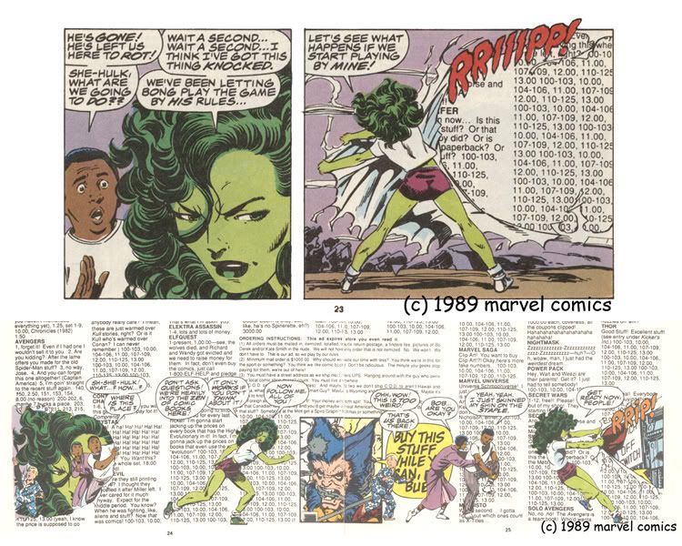
I Have always love what I term, "bargain bind" comics. This goes back to when I would go with my dad to passport comics in Van Nuys, I'd always look through the ten cent, later quarter, bind of comics and find some book that was great to me. And when i was going to buy it Earl the owner usually gave it to me. One of these classics where the various She-Hulk series' my favorite of which was John Byrne's "Sensational She-Hulk". This Book (Byrne's runs only) was my introduction to meta fictional humor. The Sensational She-Hulk was the second series to feature the character. She had appeared in the early eighties in a series known as the "Savage She-Hulk", which was created as a stop gap so that marvel would own the rights to a female analogue to the Hulk. And the first series read like just that. It was melodramatic and unengaging, and I could only recommend it to She-Hulk compleatists. However Marvel's various writers saw potential in the Jade Giantess, and she began to become one of Marvel's biggest guest stars. Then John Byrne happened. As a result of the company wide crossover Secret Wars, Byrne, who was then writing the Fantastic Four, decided that he was going to make the Thing leave the group, and then decided to replace him with She-Hulk. under his pen She-Hulk began to get a distinct character and personality. And she eventually got her own series. And boy what a series. Taking a comical approach Byrne decided that She Hulk would know that she was in a comic. This lead to the aforementioned meta fictional humor. For those that are unfamiliar with the term, Meta fictional narrative is aspects of a narrative that keep the reader aware that they are reading a work of fiction. In the case of "Sensational She-Hulk" the fun loving main character would often talk to friends about being in a comic, yell at her writer for constantly pitting her against B list supervillans, and in one amazingly mind bending break of the fourth wall in issue five (pictured) she decides to take a short cut through the pages of the book ripping the page apart and walking through. many good jokes came from this. One issue During a fight with stilt man her clothing gets shredded up all except her slip, when asked how it survived she points to a tag that says "protected by the comics code authority." But probably the most important thing for me is that it showed me that there where people behind these comics. Since the comic was all metafictioney, as well as reading a story about Jen, Weezie, Wyatt etc. I was also reading a story about this guy named John Byrne, who was writing and drawing this series about a difficult main character, and having to deal with editors not liking his jokes. Every time an inker change occurred (a trade I never knew of until I read this comic), He'd Get told just what his main character thought of them. When his other series "Namor" got some new production technique, She wondered where it was in "her" book. I think that if I had never read this book, I may have never become interested in making comics. Well John Byrne is famous for being a little difficult with editors and at Issue eight left the book. He was replaced by Steve Gerber famous for "Howard The Duck" and a rotating group of artists, a proper comedy writer, Gerber kept up the comedy angle started by Byrne, but it was a wackier humor that was not as good as the original run. Then at issue thirty-one Byrne came and continued in the style of the original run, there was a bit more of a focus on B list villains including the return of a one of "Tales of Suspense" monster Spragg the living hill. There was also riffs on the current trends of comics like countless pinups (which he actually but into the bulk of the story pages). Never a big seller Byrne poked fun at the low sales by a a series of satirical "sexy covers" where she would mention that she had to do something to drum up sales. The most notorious is the one in which "they" tell her that she has to live up to her threat of Jump roping naked (issue 40). It all came to an end though when Byrne left again at Issue fifty. But not without a final Metafictional Hurrah, issue fifty was a guest artist fest where She-Hulk was told by her editor that John Byrne was dead, and she then read the submissions by potential replacement (the guest artists) going through pages by Dave Gibbons, Wendi Pini, Frank Miller, Adam Hughes and more, until finally she picks the new team. We find out that the editor has byrne tied up in the closet and after finding out the horrendous direction he was "planning" to take the book in She-Hulk throws him out the window to his death. Unlike the first time Byrne left however, the book never hit a stride again. it limped along for another ten issues and was then cancelled. She-Hulk is a mainstay of Marvel again but no longer on the fringes of popularity, I don't think she'll ever be in a series as individual as this.

Update John Byrne's first run on Sensational She-Hulk is now available as a trade paperback :)

Art by John Byrne She-Hulk (C) & TM Marvel Comics.