
But there's one more thing to talk about when it comes to a comic and that's the cover. So for this final Production blog we're gonna talk about designing the cover....
I don't like doing covers. I don't know why and I find it very strange that I don't, but I just don't enjoy the process. I'm a decent Illustrator, and I have Illustrated a book cover or two. but for some reason when it comes to the comics I have a mental block. Maybe it's that I have to draw it after all of the work on the book itself, maybe it's that they have to be in colour. The colour is the hard part. I'm not very good at computer colouring, and if I do it by hand it has to be able to compete with computer coloured covers. For my first two covers I chose to do them as cell setups but this locked me into a simple image and it was a long process that i don't thin yielded adequate results. So I decided this one has to be on the computer. So I decided to use a method I saw mentioned by either Adam Hughes or J Scott Campbell (they both use it and I cant remember which it was) Where you greyscale the original art and then do Photoshop "washes" over it. This appealed to me because one it had the hand rendered aspect (I'm not very good with lassoing and making lines curve right digitally, I'm getting better). And two I'm an oil painter, and it reminded me of the process of the dutch masters, thus it was something I could get my head around. I then digitally painted the background. Now my digital painting is ROUGH but I was planning to blur it so I proceeded with the plan.
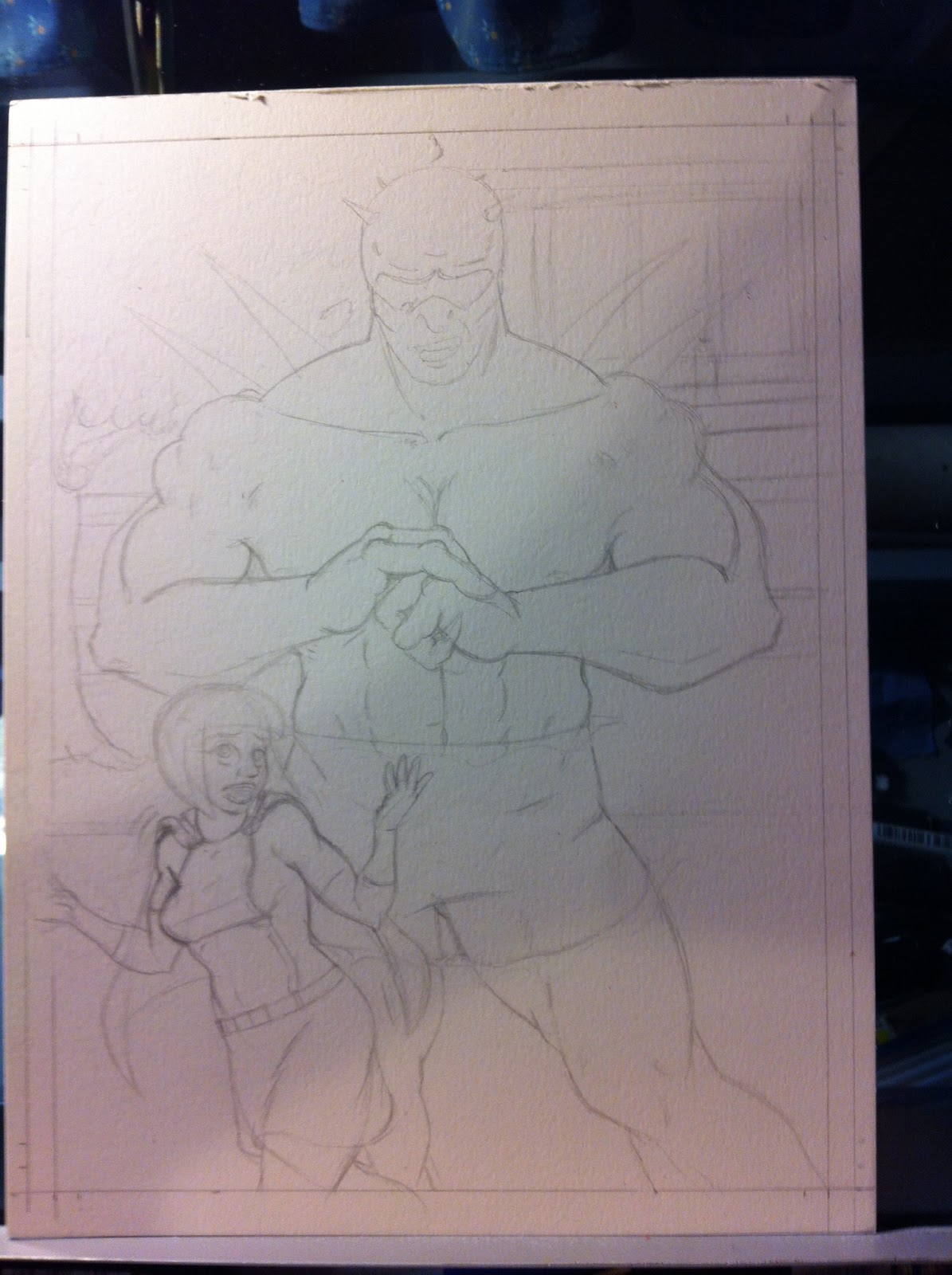
now the process.


It was at this point that one of my coworkers told me that her left hand placement looked a bit... inappropriate...


Then over an afternoon, listening to The Hitchhikers Guide to the Galaxy, I proceeded to paint the background, in a series of layers. Trying my best to make it come out like a gauche painting...


Then I blurred the background....

NARRATOR
In this Issue Hero Chick Fights Her Vicious foe yet.
HERO CHICK
Relax! It's only issue 3! it can't be that bad... Can it.
NARRATOR
Oh it can...
I then submitted the dialogue to Ruben and he suggested I let it hang at "... Can it? So that's the dialogue that I went with. So I then proceeded to import the file into Illustrator, where I placed the mast head and with my newly acquired font* Lettered the cover.
giving us this...

I hope you enjoyed this months long look into my creative process. I found it very interesting and informative to write. I probably won't be doing another one of these however since after the first couple it was mostly repeating myself. But I will most likely be posting pics of issue 4 in a couple of weeks. Until then
Enjoy.
David.
* For those that are interested the font I used is blambot's Letteromatic font. Blambot is a great comics font foundry, and they aren't all full of themselves like Comiccraft.
No comments:
Post a Comment